THE BRIEF: Thrivers Coffee was created to provide opportunities and support for survivors of human trafficking, or thrivers, through DeliverFund. The brand needed to be feminine, hopeful, and strong enough to reflect the resilience of the women it aimed to empower, while also connecting with customers on an emotional level.
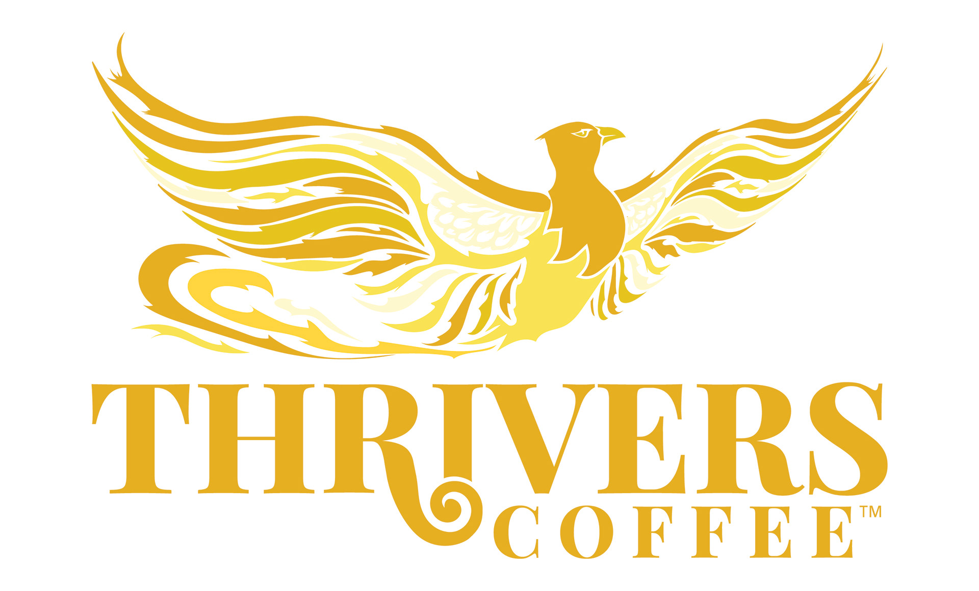
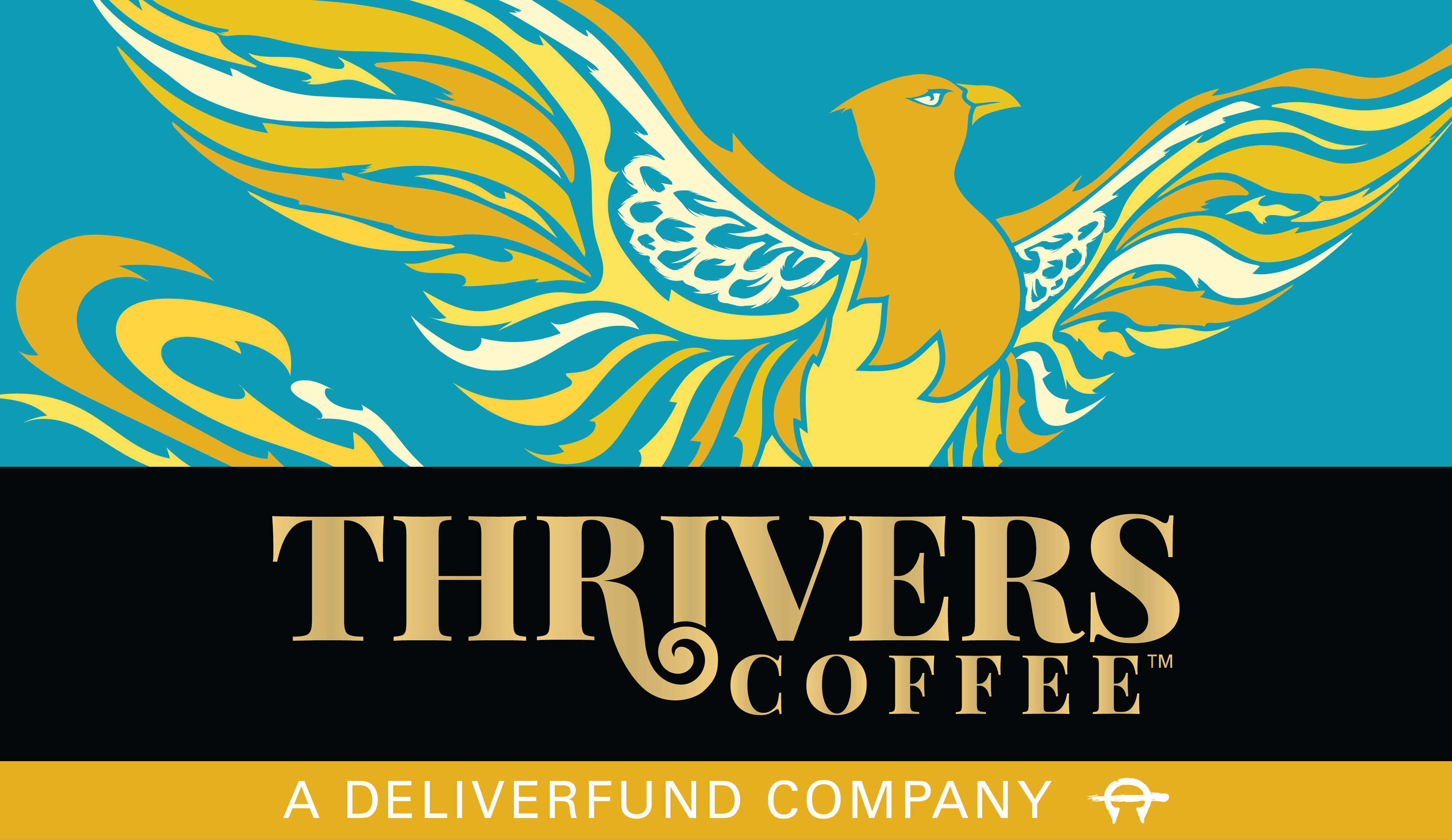
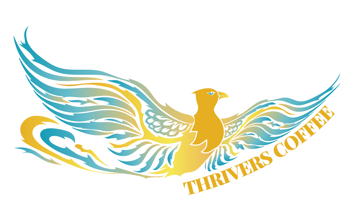
THE SOLUTION: The first place my mind went was the image of a phoenix rising from the ashes. It is powerful, emotional, and immediately communicates growth after hardship. I designed the mark to have movement and vibrancy, with a flowing tail that adapts to different uses and sizes. The phoenix became a visual representation of the strength and renewal at the heart of Thrivers Coffee.

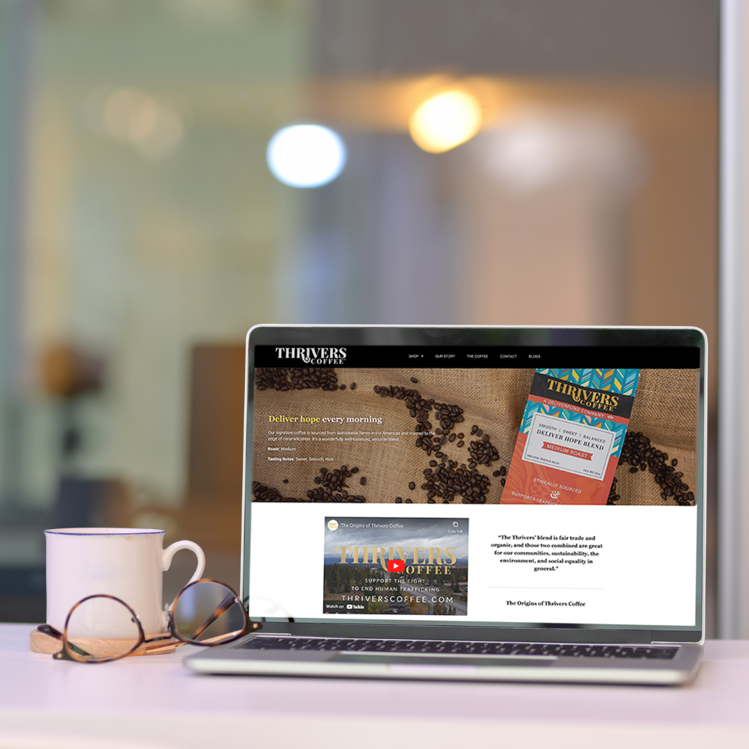
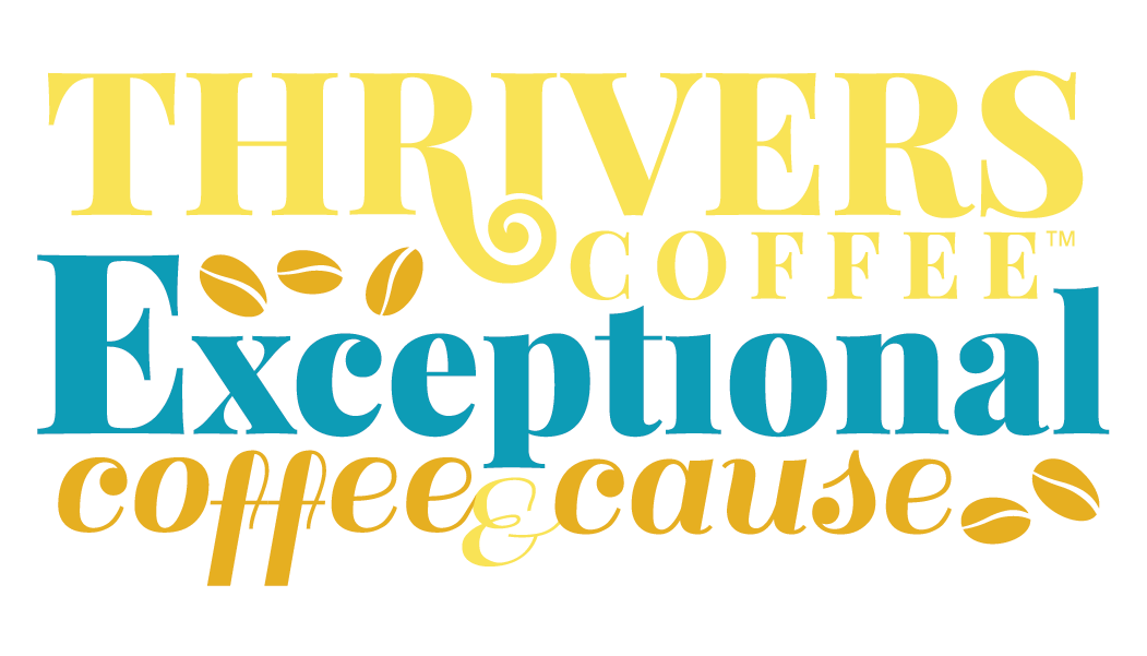
THE BRAND: The color palette takes cues from DeliverFund but shifts toward warmth and approachability. Teal, soft oranges, and salmon tones replace the bold navy and red, creating a more inviting and hopeful atmosphere. The typefaces balance personality with readability, and the wordmark incorporates a spiral below the “I” that suggests both rising steam from a cup of coffee and the phoenix itself. The lockup places “Coffee” neatly under “Thrivers” for clarity and flexibility.
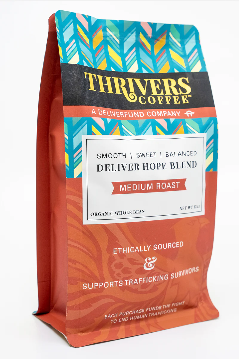

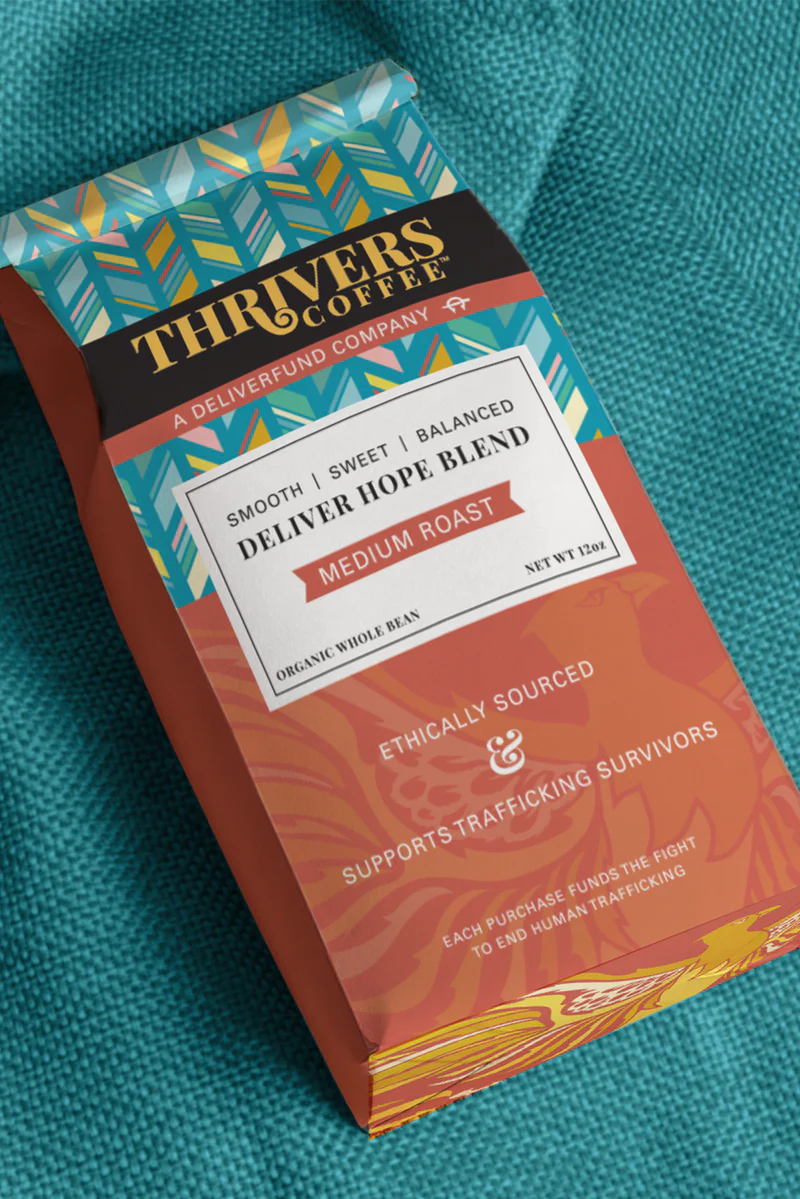
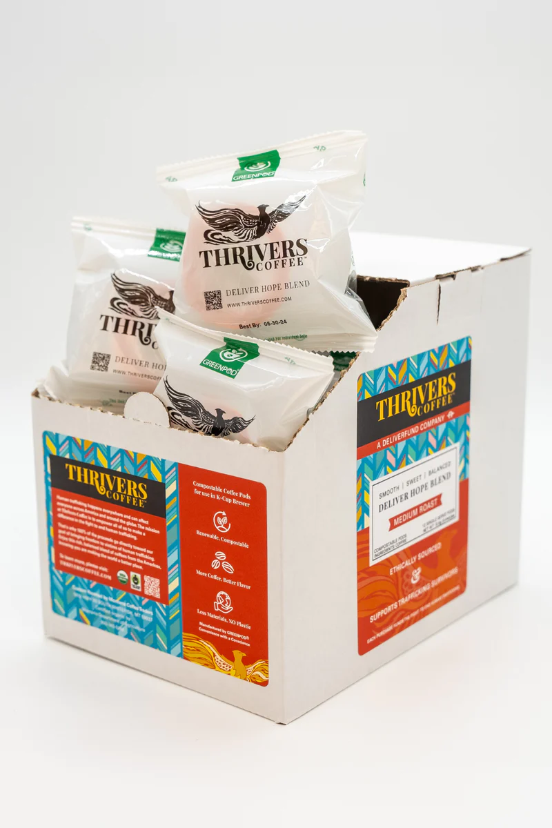
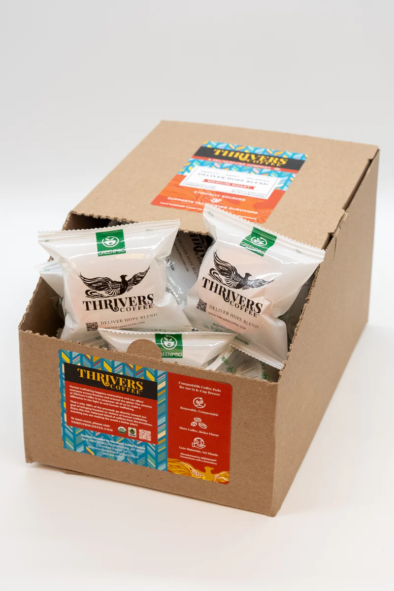
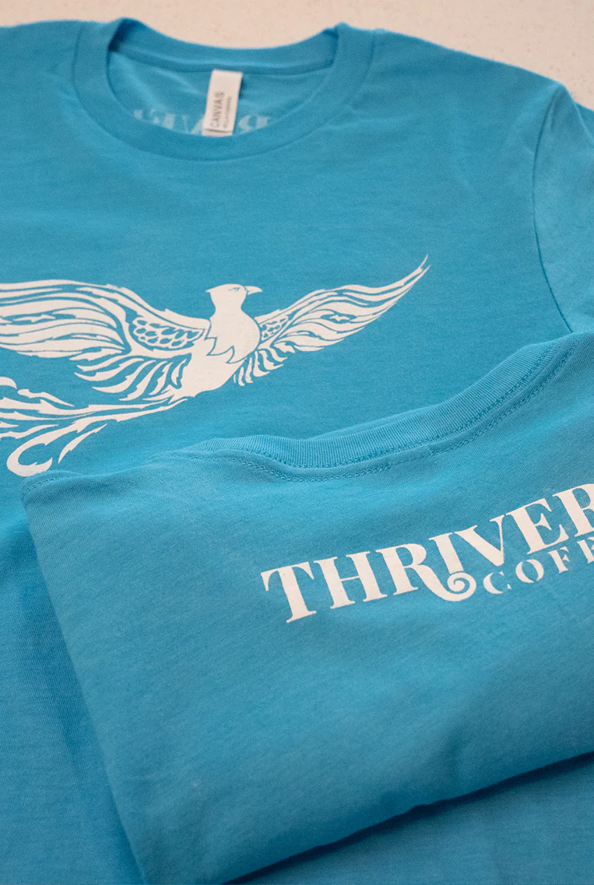



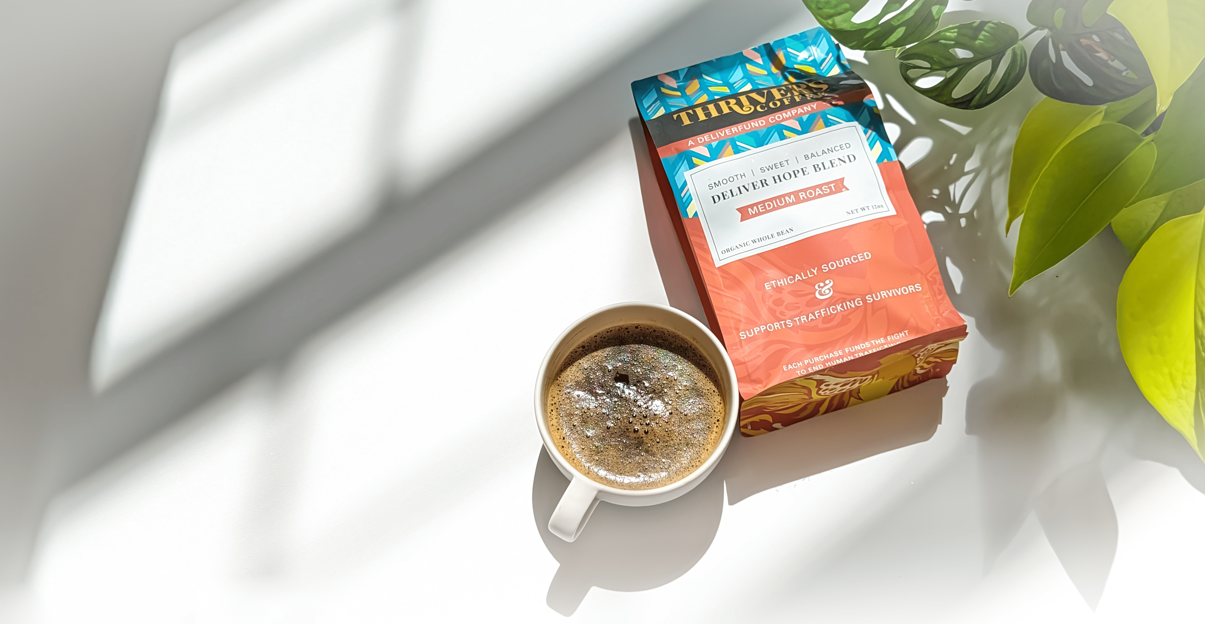
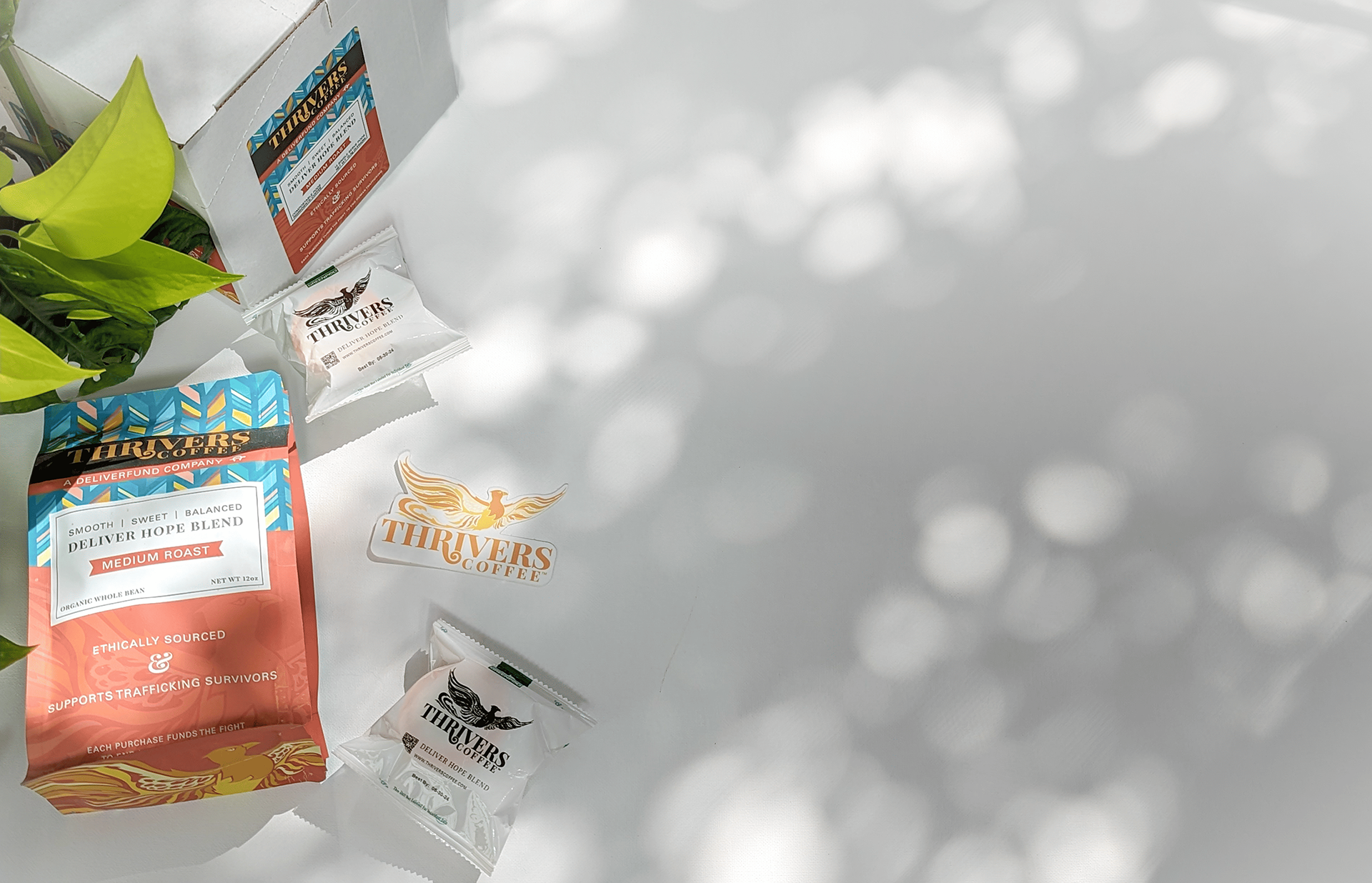
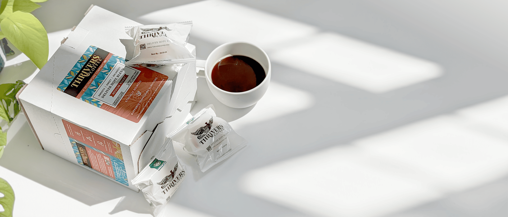
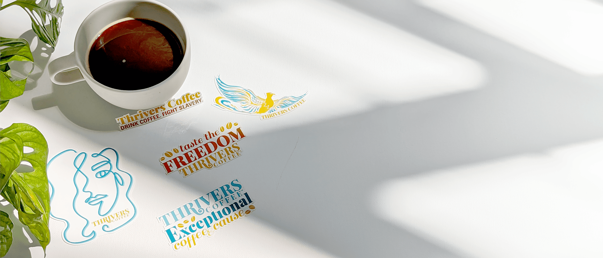
THE PHOTOGRAPHY: I shot or directed much of the photography used across the website and marketing materials. Bright white backgrounds kept the focus on the product, while soft shadows added depth and playfulness. Each image was planned with space for text and calls-to-action so they could easily serve advertising and web needs.
