VERAFI
THE BRIEF: Verafi, a tech startup specializing in thorough background checks, needed a brand identity that communicated precision, trust, and technological expertise. The goal was to create a visual system that resonated with clients and reinforced confidence in their services.
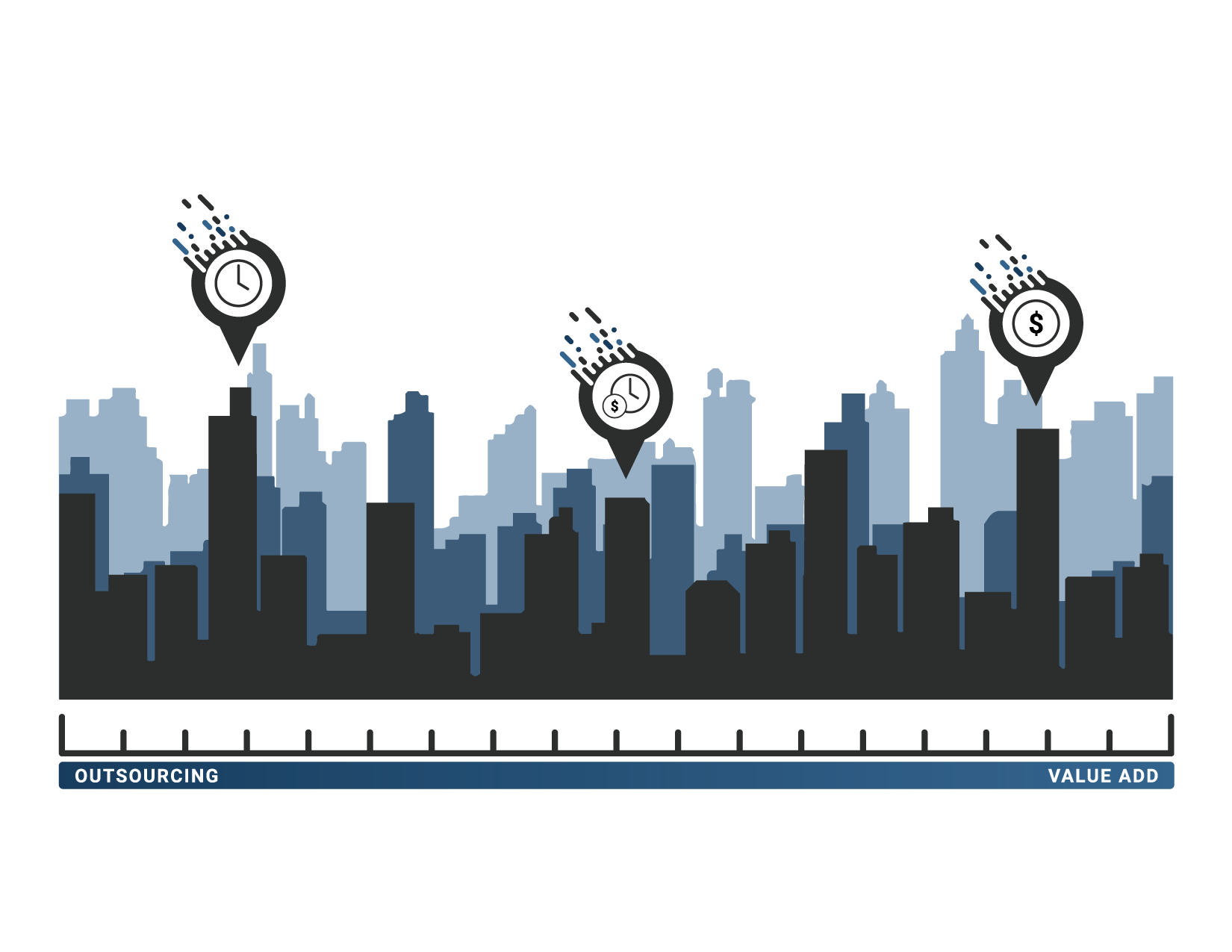
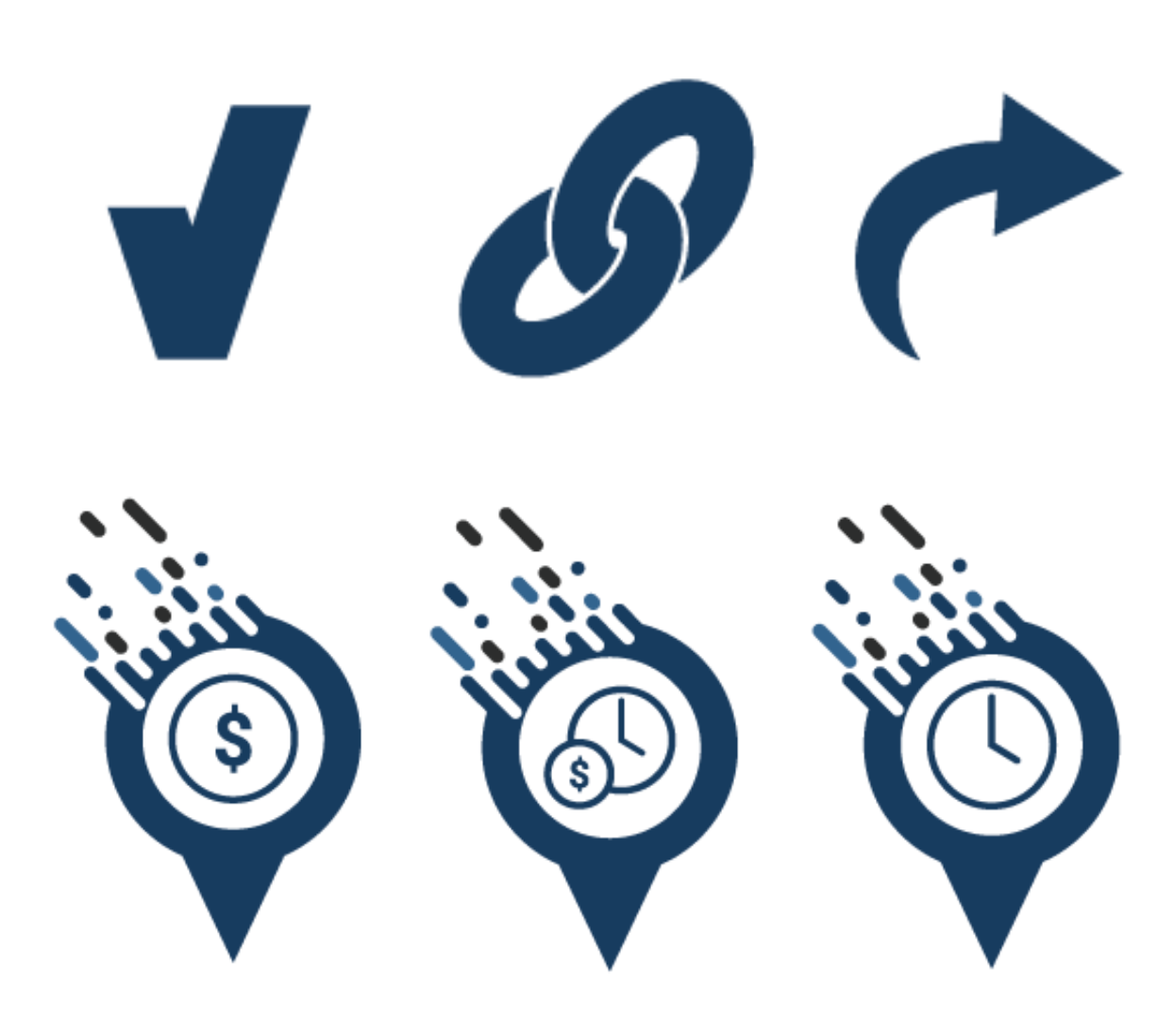
THE BRAND: I designed the logo as a data-inspired “V” to represent the company’s name and identity. By placing the data movement on the upper left, the V transforms into a checkmark, symbolizing accuracy and reliability. The visual system included icons, website design, print materials, pitch decks, and customer-facing products, all aligned to reinforce Verafi’s commitment to precise, trustworthy background checks. The company was quickly sold due to its early success.
_______________________________
THEY SAID
THE BRIEF: “They Said” is an online chatroom created exclusively for women, providing a safe space to discuss careers, work-life balance, and breaking the glass ceiling. The goal was to design a brand that felt welcoming and supportive while encouraging open, meaningful conversations.
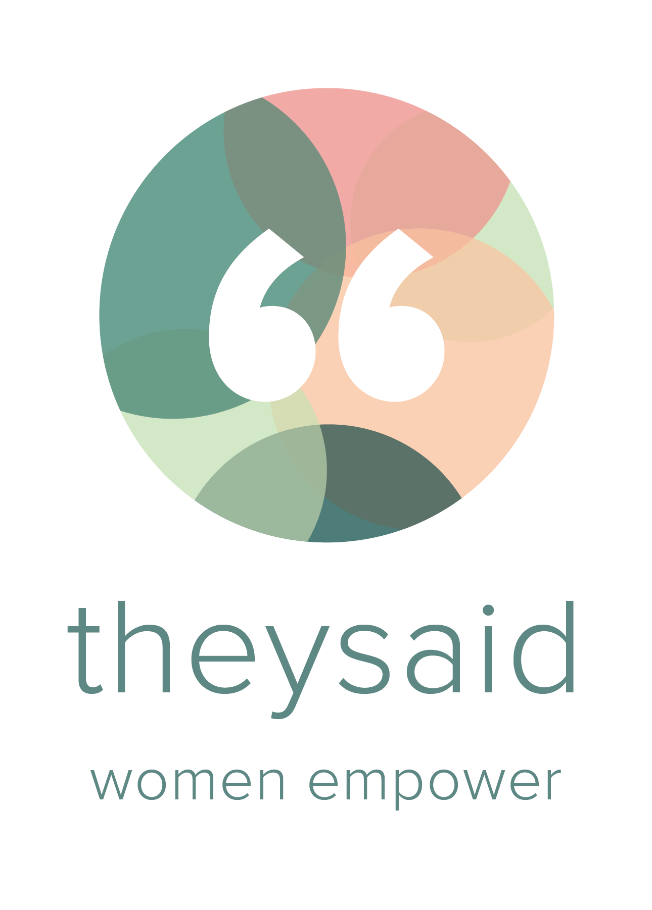
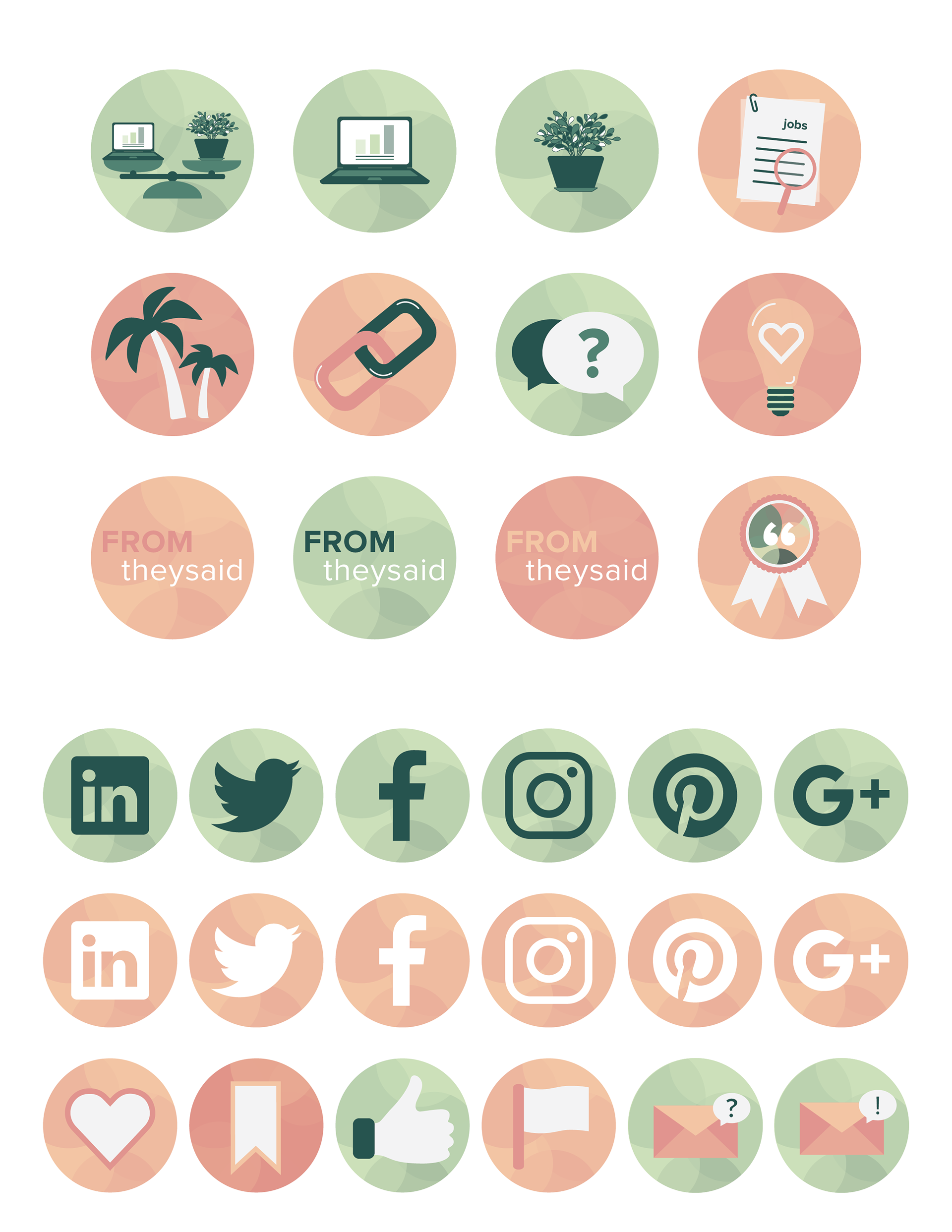
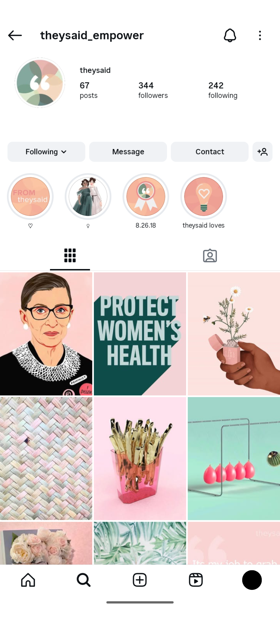
THE BRAND: I developed a visual identity with a feminine, approachable vibe, incorporating chat bubbles to reinforce the concept of conversation. The brand extended across the website, social media presence, and initial launch ads, creating a cohesive and inviting environment that empowers women in their professional journeys.

_______________________________
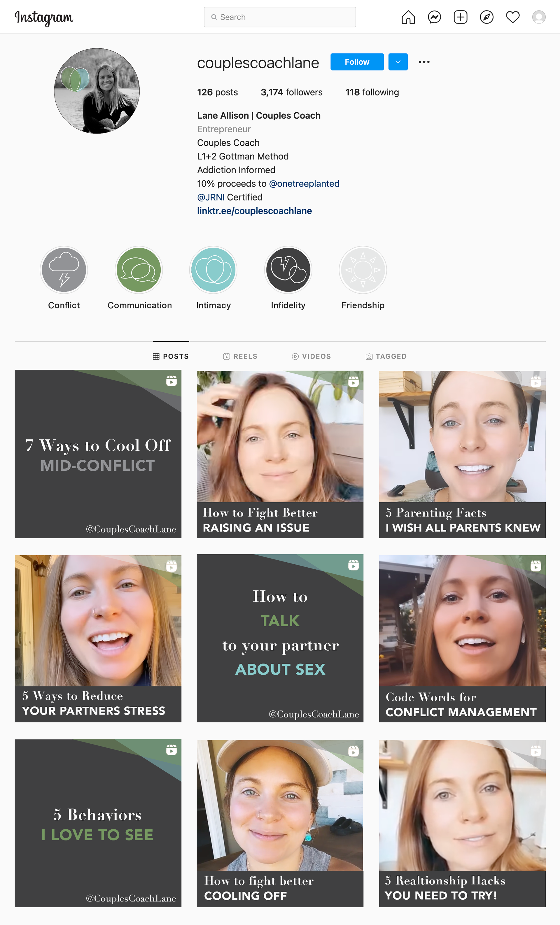
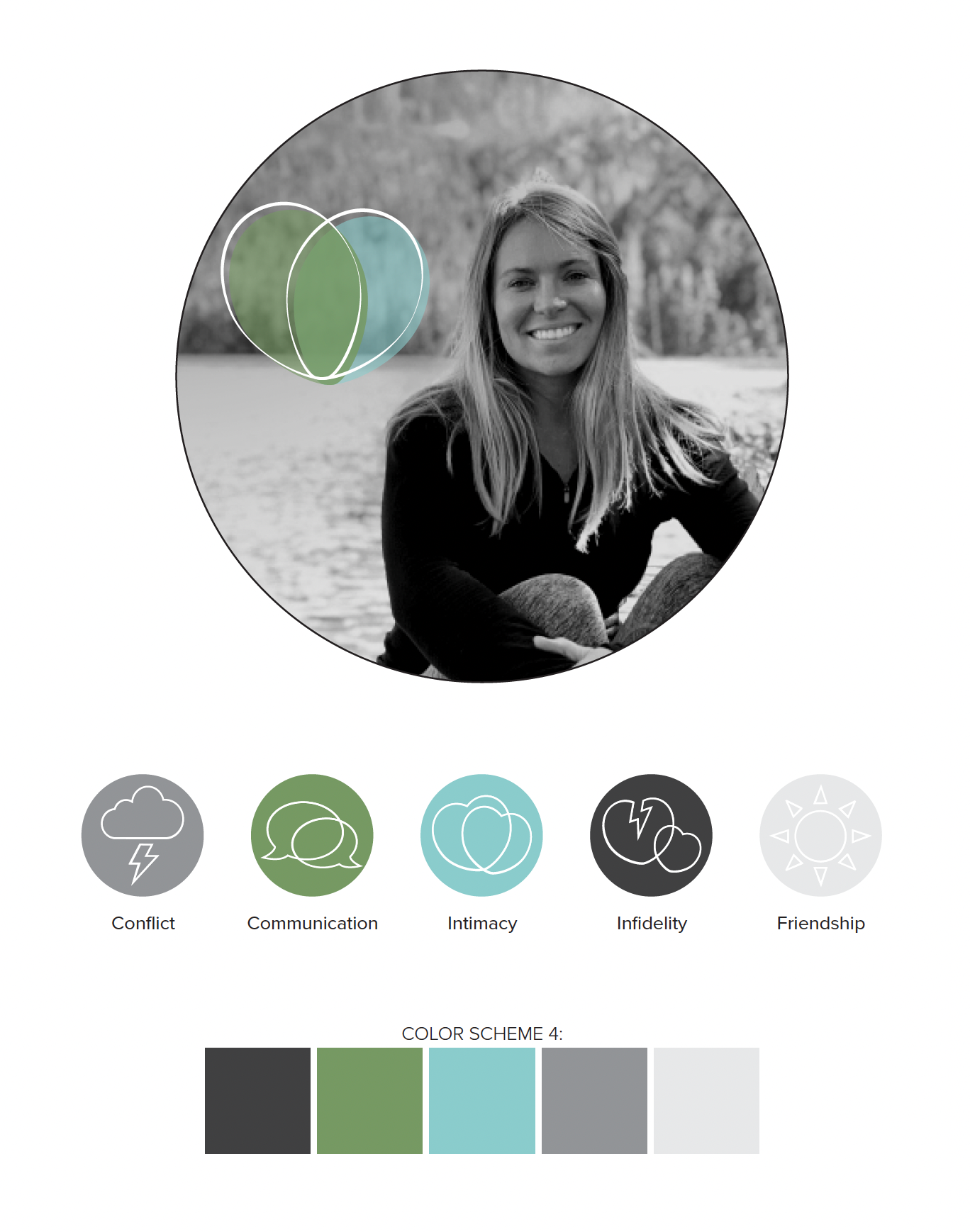
CCL
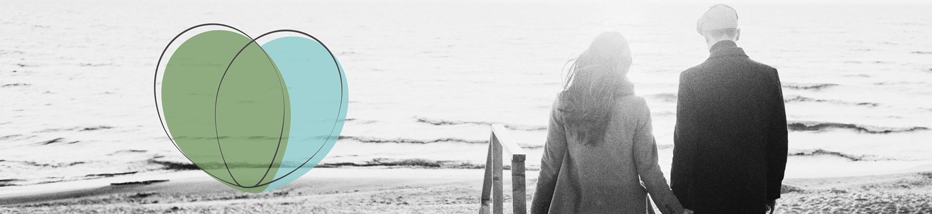
THE BRIEF: A social media influencer offering couples coaching needed a brand that reflected her authentic, approachable style. The goal was to create a visual identity that felt natural, inviting, and comfortable for couples seeking guidance.
THE BRAND: I designed a warm, feminine brand that communicates trust and approachability. The visual system supports her social media presence, coaching materials, and client interactions, creating a consistent and welcoming space for couples to engage with her guidance and expertise.
_______________________________
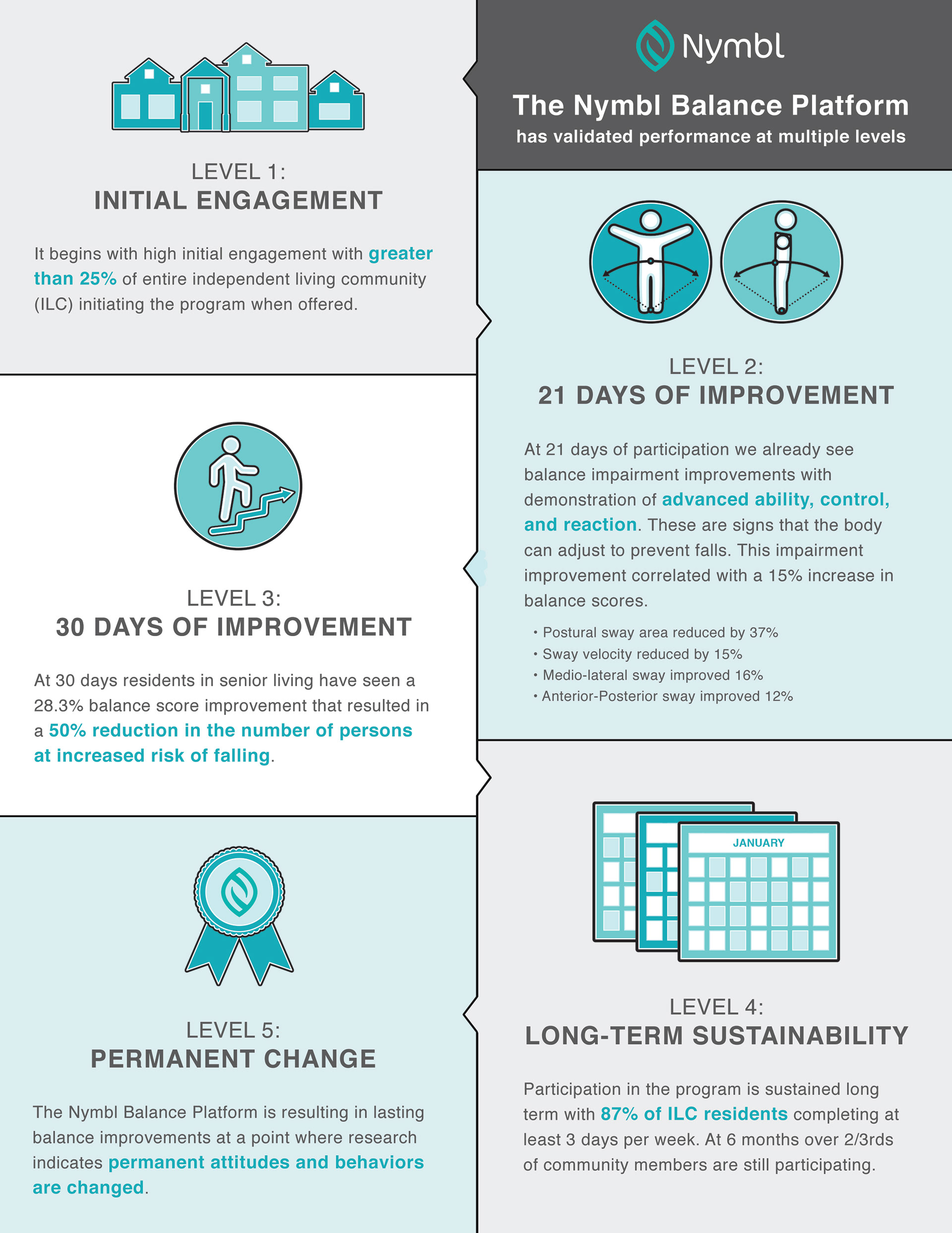
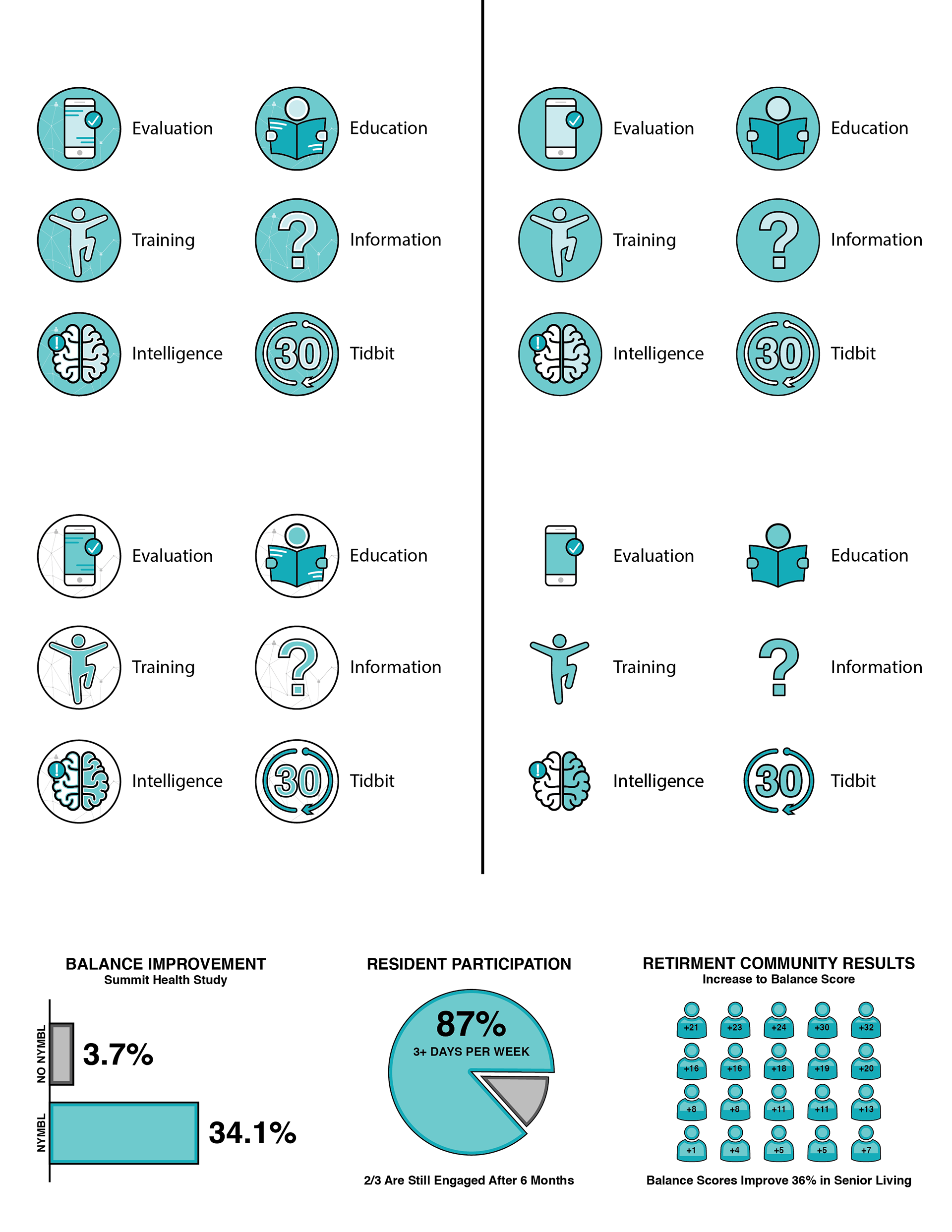
NYMBL
THE BRIEF: Nymbl, the leading fall prevention solution for older adults, needed a refreshed brand identity to clearly communicate its offerings, medical impact, and value to health plans. The goal was to create a visual system that made complex data and methodology easy to understand while maintaining credibility and approachability.
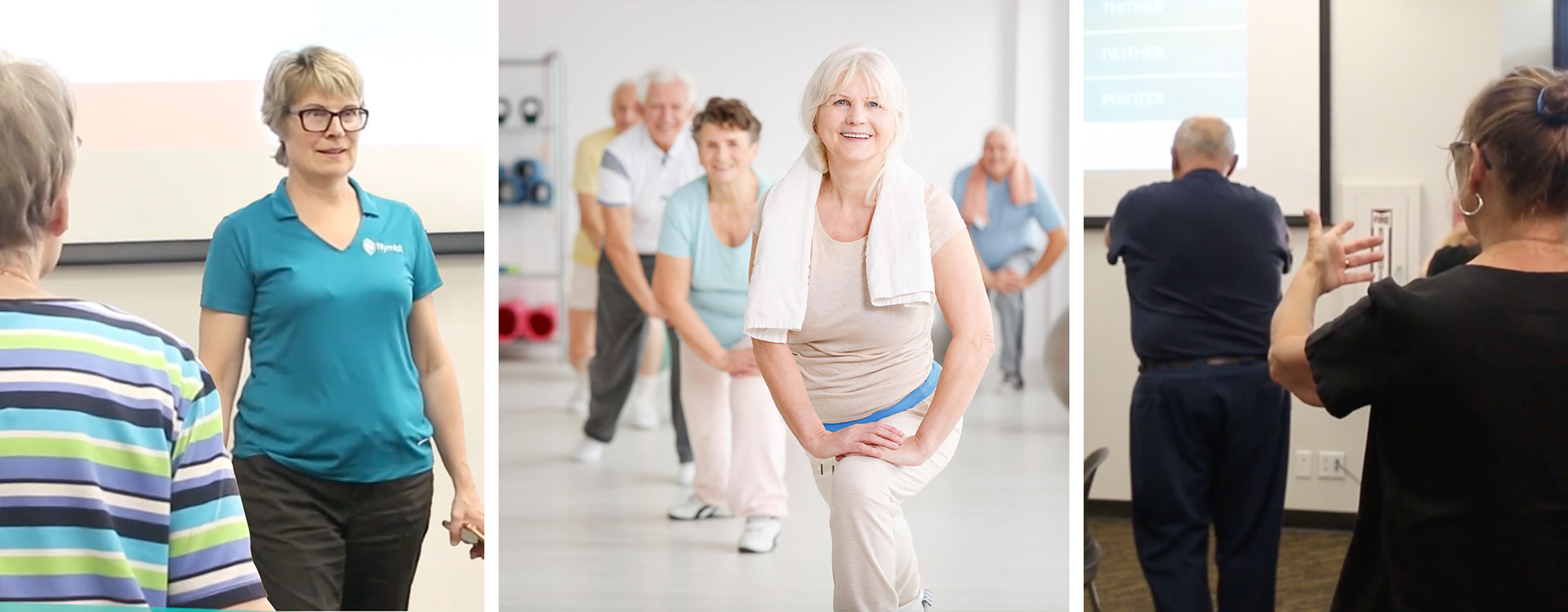
THE BRAND: I updated and expanded Nymbl’s branding, introducing a refreshed color palette, icon suite, and brand guidelines. The icons were designed to clearly communicate the product’s features, while new layouts simplified the presentation of data across digital and print materials. The result is a cohesive, professional, and approachable brand that effectively conveys Nymbl’s impact and value.